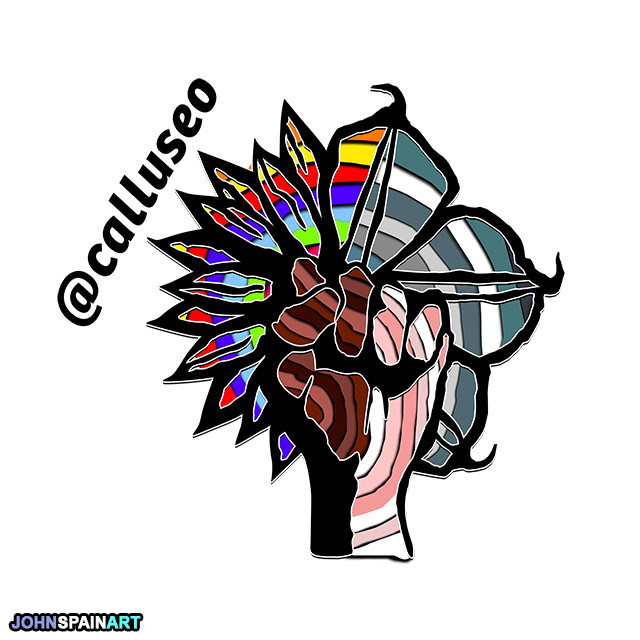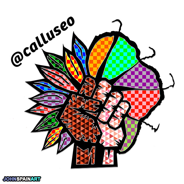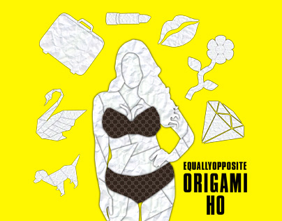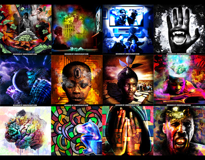
This is some of my favorite work. I like the fact that EquallyOpposite isn’t afraid of taking a risk and choosing a new style of design. These logos are innovative, totally different from traditional boring ass corporate design. I love each one of these so much lol, IMO all of them are unique and revolutionary logo design. Some of my favorite work.
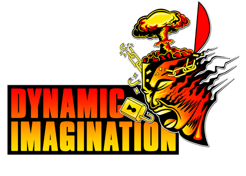
Concept: A black & White fist unified together in a moon flower. I cant take all the credit. It was a really really dope concept and they even had the idea for the retro versions which was fly too. The concept was from the group, but they gave me the freedom to do my thing with it, which I greatly appreciate. I think these logos will actually be the template that’ll change logo design one day. Probably not in my lifetime or maybe a few decades from now, but one day many logos will be graphic and heavily illustrated like these. It takes no talent to create that simple corporate bullshit that you see, but the game will flip and people will gravitate toward actual artist over graphic designers to create logos, business cards, websites…etc….